Finial Logo Haleegrace brum
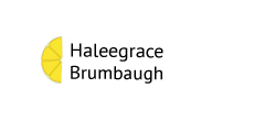
This is my final logo. On the first day of this assignment I had a clear vision of what I wanted my logo to look like. I knew I wanted my full name and the color yellow. I like my full name because if you increase the font on "Brumbaugh" it looks the same amount of letters as "haleegrace". I choose the lemon because the color yellow makes me happy, and I only drink lemon water when I'm at restaurants. Its a silly quirk but any of my friends could tell you what I drink, its something I'm almost known for. originally I wanted to do something combining my two initials like most of my peers but combining H and B didn't look very pleasing to the eye so I ditched that idea. I really wanted to incorporate my middle name into my logo somehow. I kept trying to get fancy with different combinations of my initials but it just didn't look how I wanted. after a few days of extravagant logos and trial and error with the color yellow, I went back to the basics and just wrote my name on top of my last name. I noticed how similar in characters my last name was to my first, and how the line in the h and B formed a straight line. I started messing around with half suns half moons and half lemons and I liked the yellow and how cheery the lemon looked next to the black font of my name. I finalized with my teacher and went to work on adobe illustrator.

(top 3 logos)
 (sketches)


Comments
Post a Comment