Posts

Showing posts from September, 2017
Image
Color Schemes Of Logos Analogus Colors: This Logo used the analogous colors of yellow, yellow-green, and green. I think the company probably chose these colors because the flower catches your eye because its not something many people see every often  This logo uses the analogous colors of red, purple, and a violet. I think the company chose these colors because this combo is very welcoming using many shades and tints of red and purple which all look very good next to each other. Complementary Colors  This logo uses the complementary colors of yellow and purple. Although you see this combination very often now thanks to the Lakers, its not a likely color combination. When most people see these colors together they think lakers. Smart marketing move on the larkers.  This logo uses the complementary colors of orange and blue. The company chose these colors because you can recognize the colors very easily. Warm Colors This logo uses the warm colors of yellow and orange.
Image
what I learned  In this project I learned anatomy of typeface. We were asked to write out our names, put three lines to represent the capital and lowercase letters. Then name all the different components that name up our name. How this project went Ive definitely had better work. Figuring out all the parts of my name was challenging but I'm glad I'm done and it could look a lot worse.
Image
CARP homecoming poster The project In this project we were asked to take the homecoming poster that the office made then reconstruct it using CARP (contrast, alignment, rhythm/repetition, proximity). I made the raven mascot smaller, increased the font on everything but the dates, put times and headings in bold, and changed the location of the times so they would be even with one another. What I learned In this project I learned how small changes can make a huge difference to the paper. Using CARP is actually useful because if the office would have just used four basic ideas, we wouldn't have had to fix it for a project. when the wrong things are emphasized, the paper draws no attention and not many people will take time to look at it even if its important information that the reader may need. How it went This project was easily my best. I knew exactly what changes to make to change this poster so it would be more appealing to students at ONW. I got this project done
Image
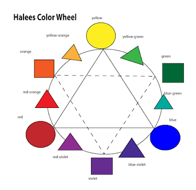
Color Wheel    Our project was to create a color wheel on Adobe Illustrator. First we learned about colors and colors schemes. Then we learned how to use adobe illustrator. The point of the project was to get a basic understanding of Adobe illustrator and the color wheel because we will use both in many different projects in the near future.     I learned how to make shapes, change the colors, make dotted lines, add text, and how to import images into my blog. Having a basic background to illustrator and the color wheel came in handy just two days later when we had to identify color terms and find logos that matched the definition.    If I were to do this again I would spend less time trying to figure out short cuts on how to make shapes and just do everything by hand. Also, I would spend more time of color selection and get lighter hues for my own aesthetic pleasure.