Posts

4th quarter Product

Image
     For my 4th quarter project, I created the idea of Zap Key. Our Project was to create a product to sell. To sell something you need ads, an animation, and a good platform to sell it on. It took us about 8 weeks to complete all the steps and get us ready to present to an audience. we faced little challenges along the way; Our video not linking to our website, trying to get our group together to film a commercial, picking who had the best ad, logo, and website design, the list could go on. But along the way we were able to work out the kinks and put together a product to sell that we could all be proud of. We learned different marketing techniques, how to collaborate effectively, what some of our strengths and weaknesses were, and ways to bring out each others strengths. During our video portion of the product we had two solid commercials that we were trying to pick between, Mrs. Zimmerli gave us positive feed back about how the video never contradicted itself and we had consistent s
css and carp design

Image
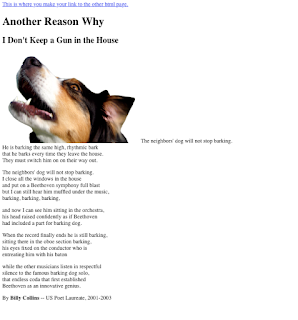
intro The difference between CSS and CARP is that the css looks like a final product, very sleek and professional. and carp looks very basic like a google doc a 5 year old could put together 5 minutes before it was due. making the changes in dreamweaver pulled the whole project together. pulling colors from the image of the dog made the page grab the viewers attention by having consistency and theme through out the webpage.  contrast- by using a black background with white text it made the reader interested, its not something you see everyday , normally its black words on a white screen, this made the page easy to look at, but still pop. alignment- the instructions were very clear to make sure everything was centered the same way, this makes the page ascetically appealing to the viewer. repetition- using colors from the image multiple times in some cases made the page look like everything belonged. proximity- this made the page look less intimidating while still gras

lion otter golden retriever beaver

Image
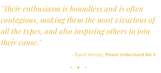
as to no surprise I was an otter and lion. Otters are social animals and love to be loved, and very often get hurt when people don't like them. this personality is compared to tigger from Winnie the pooh. strength: people person, open, positive weakness: talks too much limitation: remembering past commitments, follow through with discipline lion- likes to lead, good at making decisions. strength: goal-oriented, strong, direct weakness: argumentative limitation: hard time expressing  all of these characteristics line up with the previous tests as well. id say they're pretty accurate, teachers and friends can testify to that.

my personality type

Image
ENFP   extravert(62%) intuitive(25%) feeling(12%) perceiving(34%) How well do you think your type description describes you?  Give an example of part that is “right on”, and another part that is maybe “not so much.” I think that this discription was really accurate. I like being out of the house and doing things with people, but there are many times when I just need time by myself. Im pretty extroverted and enthusiastic and I love caring for people because that means I can worry about their problems to distract me from my own troubles. I love affection from others and always feeling included. I enjoy passing along ideas and working in groups. Im typically a leader. Does your personality type description help you to better understand why you are the way you are – and to understand why you gravitate towards some types of work, play, or activities over others?  Explain. I think enfp makes a lot of sense for me because I love being around people so any

challenge 2 part a

<iframe width="560" height="315" src="https://www.youtube.com/embed/DrOm-k36tMI" frameborder="0" allow="autoplay; encrypted-media" allowfullscreen></iframe> https://youtu.be/DrOm-k36tMI overview In this project it was realy all out testing our skills and pushing ourselves to make the best story line and execute in a time frame with segments for 40 minutes some days and an hour and 20 other days. this project was just like the last one editing wise. I had more clips to work with and I had a longer time frame to fit them all in. I liked this project because I was able to take the story line in 50 different directions, we were able to be as creative as we wanted, I was a day behind due to being gone for a mission trip so they had already filmed some clips that I tried my best to work with. my team  Since I was gone the day we decided everything, I couldn't pick my groups or have much say in the story line

challenge 1 part b halee brum

Image
what i learned   I learned a lot in this project because I've never worked with filming or editing before. Following the video procedure was too confusing for me so i ended up using more trial and error and help from Holly. the audio was the hardest part and sometimes it works and other times it didn't.  what i liked I really liked getting to be creative with my angles and video shots and having freedom to do whatever as long as i was able to make it around 30 seconds. the actual filming part took little time at all the editing wasn't hard after i had tried a couple things and figured out what looked best.  what i would change I had to cut out a small portion of film so I could fit the time limit which made the establishing short and choppy. So I wish I could have made this smoother but I didn't notice until someone other than holly and I said something. creative process  Holly and i had so many cool ideas of shots to take but we couldnt fit them

Website

Image
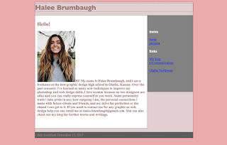
My final website Overview I really liked this project because I was able to make it show my personality more that any project  I've done so far. I wish I would have started this a week earlier just so I could work out some of the kinks and just polish everything off. In my class it was cool to see all the little different quirks each student added to their website to show how unique everyone is. I went with a pink color scheme because I love different hues of pink and looking at the colors on my website made me want to keep working on it. The shades were all very subtle and not over powering so if someone looks at my website they won't get blinded by a neon pink. The colors are welcoming and all work well together. How it went I watched the first video and had a pretty good idea of what I was supposed to be doing. I got the basics done and took it and ran with it. everything was going great until sometimes my links would work and sometimes they wouldn't. Up