Website
My final website


Overview
I really liked this project because I was able to make it show my personality more that any project I've done so far. I wish I would have started this a week earlier just so I could work out some of the kinks and just polish everything off. In my class it was cool to see all the little different quirks each student added to their website to show how unique everyone is. I went with a pink color scheme because I love different hues of pink and looking at the colors on my website made me want to keep working on it. The shades were all very subtle and not over powering so if someone looks at my website they won't get blinded by a neon pink. The colors are welcoming and all work well together.
How it went
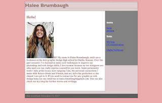
I watched the first video and had a pretty good idea of what I was supposed to be doing. I got the basics done and took it and ran with it. everything was going great until sometimes my links would work and sometimes they wouldn't. Uploading my projects took way longer than it was supposed to so that held me back. I really liked what I did with my elevator pitch and the picture I used was edited to fit my color scheme. over all it looked how I wanted to.
What I would do different
I would have loved to start this project earlier so I wasn't finishing up right at the bell. For this being my first website I felt like it looks pretty good. I would have added captions and described the projects so anyone looking at my website knew what was happening. Other than that I felt pretty good and wouldn't change anything.


Comments
Post a Comment